ShopDreamUp AI ArtDreamUp
Deviation Actions


Suggested Deviants


Suggested Collections


You Might Like…


Featured in Groups


Description
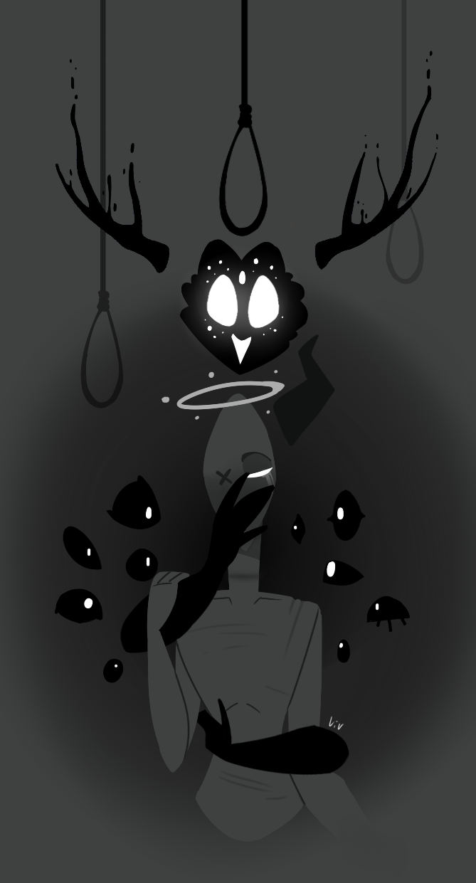
"I cant sleep"
Zero is scared of Hope
Zero is scared of Hope
Image size
669x1241px 182.42 KB
© 2016 - 2024 VivianneSketch
Comments19
Join the community to add your comment. Already a deviant? Log In
Let's start with the IMPACT (4.5/5)
This popped out to me while I was scanning through all the deviations that came into my groups. I usually click on one deviation per 100s. So that should say a lot how impactful this is. The strong contrast definitely gives its impact, but its composition is also very noticeable. So kudos to you. I think the only way you can increase the impact on this would be to carefully place one bright/strong colour. But without it, it's already good.
VISION (4/5) + ORIGINALITY (4/5)
So the strong impact drew me in. But it's the creativity and originality of this piece that made me stay. Is it an evil killer trapping you, while eyes watch? I'm not sure, but that's what I interpreted. I love that it can be interpreted in many ways. I like that it's unclear, yet purposeful. It's very simple yet thoughtful. It has a feel that it's well planned. I like dark and creepy art and have seen many, but this one sure stands out as original. Very cool.
TECHNIQUE (2.5/5)
I should have looked at your other pieces, but if this is your own style, that's very cool. It has its own streamlined look. The only reason I scored a bit lower on this is because it is on the borderline between "style" and "less technique". Though the contrast and impact is high, if you look at details, the range of shades used is narrow. Everything is very simple, and the background is flat. I am not sure if this is intentional, meaning this is your style, or not, meaning you can't draw with more details/more realism, etc. If it is intentional, I think a little more attention to the smoothness, thickness, value, of lines, and wider range (more subtle shades) of grey would be wonderful.
But overall, very creative, very interesting piece that makes me wonder what it holds. Good job!